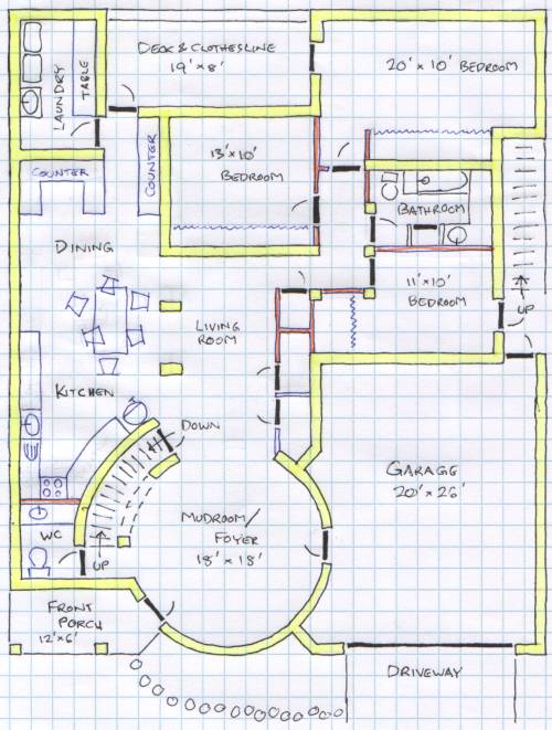
This plan is an optimization of the previous plan. (There was also an intermediate design between this and that.)

This has the foyer, living room, kitchen, and dining room all flow into each other. The skylight is gone because the family room now gets light from two sides, from the foyer and the kitchen. It got more counterspace by eliminating second doors to the center back bedroom and the half bath. It has a bigger center back bedroom because I made the closet not so deep and made the hallway to the laundry room narrower. It has a bigger center right bedroom because I made the closet not so deep. And it has more closet space because I lined the whole right wall with closets. The bedroom hallway is a little wider.
Now this arrangement is about tied with the previous arrangement (design I).
The back center bedroom blocks light from the back to the living room. The living room serves no obvious purpose. The laundry room is far from the bedrooms. The laundry, full bath, and kitchen sink all need hot water and are quite far apart. Although I like having the round room as the entrance, I don't like how the tower looks from the street.