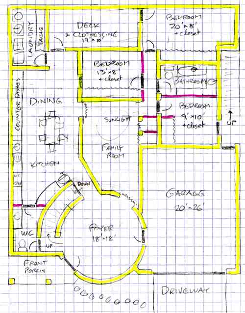
This plan is a severe rearrangement of the previous plan. It's still 50'x60' with about the same rooms, stairs, and decks. What's different is the tower is now front and center in the house, rather than in the middle of the left side, making the round room the mudroom/foyer. The kitchen and dining area have moved along the left side where the tower used to be. The long room is replaced by a compact 9'x17' family room with a second floor opening with windows at one end. The bedrooms are smaller but less oddly shaped, and now all off a hallway in the upper right corner. The upstairs bath and extra room would now be over the family room, splitting up the roof into a U-shape.

Having no mudroom is a real loss. Most of the bedrooms are smaller, but the kitchen/dining room is a little bigger. The odd-shaped long room is replaced with a more normally shaped family room. I'm tempted to line the family room with bookshelves. The master bedroom (the second floor round room) is now directly facing the street, so it will be noisier. There's a little water closet (half bath) in the corner between they foyer and the kitchen; that's odd. Splitting the roof into a U-shape gives the roof more, but smaller, spaces. You can no longer see a back door from the front door. You can see to the deck door from the front of the foyer, and to the bathroom door in the hall from the stairs in the foyer, unless furniture gets in the way.
This does much better with privacy zones, leading from a public foyer to a semipublic kitchen/dining area to a semiprivate family room. The bedrooms are all off a small kneebend hallway off the long room. Drapes could hide the hallway. The wall to the stairs is cut out, so the family can sit on the stairs and talk to people in the foyer getting ready to leave.

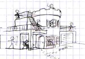
Unlike most previous plans, this flaunts the huge tower. Keeping with this flaunting theme, we'll give the tower turrets (although the rest of the roof is still caged in by metal or plastic fence). I currently have a theory that windows need obvious borders to look good, so give all the windows borders. Give the round window in the second story tower some half-circle shutters.
A 50'x60' house sits very heavily on a 60'x90' property where the house is inset 20' from the street. I've got only a 10' back yard, and 5' on either side. Big trees would have to go in the front yard or near the property line in the back yard.
I think I liked the previous design (design I) better than this one, but this is the first floorplan after I rearranged a bunch of stuff. Perhaps it can be tweaked some.